One seed can start a garden, one candle can light a room, one step can begin a journey, one conversation can start a friendship, one smile from a handmade card can lift one's SPIRIT!

Showing posts with label Color Throwdown. Show all posts

Wednesday, March 9, 2016

Color Throwdown # 383

Color Throwdown has green, yellow and orange..good colors for flowers!!
I pulled out the PTI Anniversary free stamp set Painted Petals, used a little green watercolor for the background and inked up the flowers with yellows and oranges.
I know just the person I will send this too My 92 year old Aunt!!
 
Thanks for taking a look!
Heart Hugs!

Thursday, January 7, 2016

the Color Throwdown # 374

I am playing with the Color Throwdown Challenge today!
I am too tired to sit and write much, have been making a dinner for 20 people since 9:30 this morning...I am worn out!!  It might be time to turn this dinner over to a younger generation~ 

stamps & dies:  PTI Beautiful Brushstrokes, 
Keep it Simple:  Birthday, HA Happy Stamp & cut
paper:  PTI chicken scratch gingham


Monday, August 3, 2015

Color Throw Down meets Freshly Made Sketches!

I am playing with Color Throwdown and 
I used some watercolor paper and Zig Real Brush markers for my flip flops and for the Palm Tree and sun on the banner after it was white embossed.
 
 
The flip flop straps really are a purple, I couldn't get a very good picture.

Wednesday, May 27, 2015

Color Throwdown #344

I am entering this in the current
Color Throwdown Challenge

stamps & die:  Avery Elle: Get Well
I fussy cut the sentiment and adhered it with dimensional tape.
The panel is embossed with the wood grain EP from PTI .
I colored it with copics and embossed the sentiment with a Ranger Embossing powder.
Thanks for taking a look!

Wednesday, August 28, 2013

Color Throwdown # 257

Well, I made two cards because I wasn't sure if I liked the first one, and now I am not sure I really like the second one either.  My father raised "mums" which is what this set is called"  Mum's the Word from PTI.  I really don't think mums are pink, or at least not a hot pink, but in the world of card making, I think anything goes, right?  But the colors did bother me a bit...so I tried making a second card:
So this one has the colors of mum that is more true, (except maybe that little one that has a bit of pink...do you see it over on the side?  Oh well, the challenge was to use these colors:
                                          
                                                                                                                                                                             So if you want to play along with this challenge, go HERE to access the blog and see the other cards the design team made.


Friday, July 12, 2013

Color Throwdown ~ Fifth Anniversary Celebration

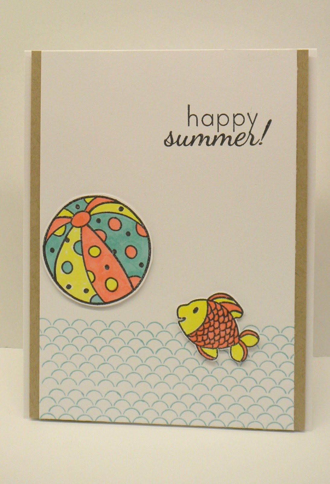
Awesome colors for this special anniversary celebration going on over at Color Throwdown ~ check it out!
I used a Hero Arts summer stamp set and colored in the ball and the fish with copics.  Isn't that fish so cute?  He is jumping out of the water to pop the ball back to the shore!!
                                                                             
I used hawaiian shores ink for the "waves", and copics to represent all those colors above.  I am thinking a couple more Happy Summer cards will be made to sent out to my three aunts in July...oh, one has a 94 birthday coming up...I better get on it!

Friday, June 7, 2013

Color Throwdown # 245


                                                                                    Want to play along with the Color Throwdown Challenge?  Go HERE to access the blog and play along.  here is my card for this challenge.
 I used an old Papertrey Ink stamp set called Flower Garden...I stamped it on white paper, sewed around the edges, then mounted it on the lemon tart Bitty Box Pattern Paper.  I stamped some melon berry polka dots from Background Basics:  Polka Dot II.  I added a little dashed line with a jelly roll pen on the yellow band strip.  The sentiment is from a Hero Arts sentiment set.  I can see that I didn't line up the polka dots all that well...that is one thing that I always struggle with!  Sorry about that...

My PTI colors are:  berry sorbet, melon berry, spring moss, lemon tart and white!                                                                                

Wednesday, May 15, 2013

Freshly Made Sketches # 86 and Color Throwdown

This card is for my daughter...I can't believe she is going to be 34 on Friday...we are taking her family to Disneyland...well, it is for the kiddos; the youngest is 4 and the next older will be 6 in July and the older one is almost 14!  Yikes, where do the years go?  The younger two have not been to Disneyland, we decided it was time for them to experience the thrill and magic of Disneyland before they are too old and don't believe in Princess's or pirates...!

This card has all the colors for the Color Throwdown Challenge which you can access HERE.  And also for the Freshly Made Sketches which can be accessed HERE .

All products Papertrey Ink,
  paper: white, blueberry sky, summer sunrise, pure poppy pattern paper
  ink:  pure poppy, summer sunrise, ripe avocado, memento bahama blue
  stamps:  Birthday Style, Headline Alphabet
  die:  heart border die.

Wednesday, March 6, 2013

Color Throwdown and Moxie Blog Emphasize the Negative Challenge


It's Day 2 of the moxie-tacular celebration of the trends found in the latest and greatest special issue published by Paper Crafts magazine, Card Creations, Volume 11!  It is all about the NEGATIVE!  Another great trend!  I die cut the word LOVE  and backed it with  Hawaiian shores paper.  I am also entering this in the Color Throwdown # 232.

All things PTI
stamps:  Beautiful Blessings, Natural Beauties
ink:  berry sorbet, hawaiian shores
paper:  kraft, white, hawaiian shores, fine linen
misc:  Headline Alphabet dies, fabulous frames